In today’s digital age, having a well-designed website is crucial for any industry, and the field of education is no exception.
According to BusinessDIT, “94% of first impressions of a website are design-related.”
This statistic indicates that the look and feel of a website is incredibly important when it comes to capturing the audience’s attention. If a website is poorly designed, it’s likely that the visitors will leave quickly without exploring further.
This holds true for an EdTech company as well, since it plays a pivotal role in capturing the attention of students, parents, educators, and councillors. The website, which functions as a central hub, not only disseminates crucial information but also acts as a versatile marketing tool for active engagement with the target audience.

In this article, we will explore the importance of website design in the education industry and delve into the key elements of an effective educational website design. Furthermore, we will showcase ten outstanding edtech website designs that are worth checking out, along with insights into why these designs are worthy.
1. Why Edtech Firms Need a Website?
A website is often the first point of contact that potential students, parents, and educators have with an edtech company. It is crucial that this initial interaction leaves a positive and lasting impression. A well-designed website can establish credibility, foster trust, and create a sense of professionalism.
Here are a few advantages of having a well-designed edtech website:
- Boosts Awareness
If you want to expand your brand reach, it is imperative to have a fully functional website. If you look at the best edtech website design, you will find branding critical. For example, there is consistency in typography, logo, and colours of the best education websites – Coursera, Chegg, and Blackboard. If you want your edtech brand to be in your audience’s mind, you can create a website that reflects and defines your business.
- Builds Trust
A feature-rich website with detailed information about your company, products, and services helps you build trust and recognition without burning holes in your pocket. People won’t trust your brand if it has no website, as a business without a website is virtually invisible. Having a website increases your online visibility and establishes social proof, eventually boosting business credibility.
- Generates Qualified Leads
A high-quality website with relevant content, images, videos, CTAs, and navigation can help generate qualified leads organically. It is bound to get a consistent flow of visitors from search engines like – Bing, Yahoo, and Google. With a website, you can reach out to potential customers more quickly than your competitors. Also, it becomes easier to keep track of your marketing efforts and the ROI.
- Improves Conversions
An Edtech website is your best marketing tool and often extends to every aspect of your marketing strategy. Your target audience would check your website for validation before reaching out to you. It is undoubtedly the first point of contact for your audience. A high-quality and fully-functional edtech website can increase the chances of conversion significantly.
Now, let’s explore some crucial components of a well-designed educational website-
2. Key Elements of Effective Educational Website Design
To create a successful educational website, several key elements must be considered during the design process. These elements work together to optimise user experience, promote engagement, and ultimately capture the audience’s attention.
- User-Friendly Navigation
A well-structured and intuitive navigation system is essential for guiding users through the website. Clear menus, logical categorisation, and easy access to important information contribute to a positive user experience.
- Responsive Design
With the increasing use of mobile devices, it is crucial for edtech websites to be responsive and adaptable to different screen sizes. A responsive design ensures that users can access the website seamlessly from any device, whether it be a desktop computer, tablet, or smartphone.
- Engaging Multimedia
Incorporating multimedia elements such as images, videos, and interactive content marketing strategies can make the learning experience more engaging and dynamic. These elements can enhance the understanding of complex concepts and grab the attention of the audience.
- Calls to Action
Effective calls to action (CTAs) prompt users to take specific actions, such as signing up for a course, downloading a resource, or contacting the instructor. Well-placed and enticing CTAs can increase conversion rates and drive user engagement.
- Accessibility
Ensuring that the website is accessible to all users, including those with disabilities, is crucial for providing an inclusive experience. Features such as alt text for images, closed captioning for videos, and keyboard navigation options are vital for making the website accessible to everyone.
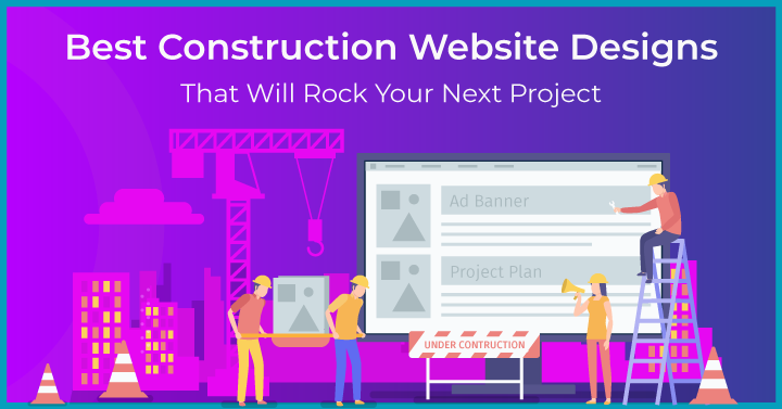
3. 10 Best Edtech Website Designs that are Worth Checking Out
3.1 ClassDojo
ClassDojo is an online classroom community for teachers, parents and students to collaborate and share ideas. The website has a simple but elegant design, a well-organised menu, a perfect choice of colours, and highlighted sections. The website features a detailed footer with sections segregated in a structured manner, which makes it easier to find information.
The text is bold in a few places, while the areas that need attention are highlighted in purple, which instantly grabs visitors’ attention. Using multiple fonts and vectors makes the website look attractive and sophisticated. With plenty of information for students, parents and teachers – the website would succeed in engaging its audience.
3.2 Duolingo
Duolingo is a language-learning education platform that offers courses in 40 distinct languages. The design of the Duolingo website is neat and clean, with a blue and green colour scheme and a lot of white space. It has an organised footer section with a large amount of information on Courses, Mission, Team, Approach and Efficiency. The use of Duo (Green Owl) for every subheading of the homepage makes it light and easy to read.
The website has an organised feel and highlights the fact that anyone can learn the language with Duolingo. The navigation is intuitive, answering the common questions learners might have. There are multiple CTAs that are downplayed and yet prominent for users who want to get started. Overall, the website is made in such a way that the learners can easily find what they are looking for.
3.3 Coursera
Coursera is an online education platform that provides online courses and degrees from world-class universities. Coursera has a simple website with minimal usage of colours, fonts and images. The website has a header menu covering – Online Degrees, Find Your New Career, For Enterprise, and For Universities. The homepage highlights details of their Partnership, Professional Certifications, Master’s and Bachelor’s Degrees, MasterTrack Certificates, University Certificates, Courses and Specialisations.
On the whole, the website is generic to students, professionals, teachers, and educators. The footer menu narrows down to diverse categories – Popular Collections and Articles, Popular Courses and Certifications, Start or Advance Your Career, and Earn a Degree or Certificate – making it easier for specific audiences to navigate to their choice of interest.
3.4 Skillshare
Skillshare is an online learning community offering business, technology, design classes, and more. This is the best edtech website design with many images, pleasant colours, and relevant content that makes the website look beautiful and elegant. The fonts and colours are consistent throughout the website, giving it a professional look. In addition, the website uses high-quality professional pictures and videos that inspire the visitors to take action, like – signing up for a course or getting started for free.
The Skillshare website has a community section for users with all information about Team Plans, Free Classes, Scholarships, and Limited Memberships. In addition, the Technology section in the footer has complete information for students regarding high-tech subjects like – Game Design, Data Science, and Mobile/Product/Web Development. All these sections in the footer make it easier for professionals to choose the desired course seamlessly. For everyone else, the website has FAQs that answer all their queries.
3.5 Edsurge
Edsurge is an independent community of information and resources for educators, investors and entrepreneurs. Unlike other edtech website designs, Edsurge has simple and straightforward sections that communicate who they are and what they do. The homepage features a variety of sections like – Podcasts, Newsletters, Webinars, and Top Stories that engage the visitors for a long time.
Besides, a diverse range of information on Higher Education, Edtech Business, PK-12, Hot College Models, and more caught our attention. With brilliant messaging, there are several things on the website that professionals of all kinds can take inspiration from. Moreover, all the CTAs on the website are neatly tied together and prompt the visitors to take subsequent action.
3.6 Quizlet
Quizlet is a digital learning tool for parents, students, and teachers to practise and become experts in whatever they are learning. This is an example of the best edtech website design with a primary focus on interactive tabs, colours, textures, and quick-access icons. Quizlet seems more like a gaming website than an edtech website, but that’s what the users love about it.
The blue and white colour palette with animated screenshots and images creates a pleasant user experience. If you are looking for some inspirational and concise navigation, you can hover over the ‘Subjects’ on the menu. Overall, the use of bold fonts, creative graphics, and structured content keeps the users on the website.
3.7 Blackboard
Blackboard is a leading edtech solution provider offering a web-based virtual learning environment and learning management system. This best edtech website design can be characterised by a combination of black, grey and white colours with clean and smooth navigation. Typography, colour coding, images, and CTAs in each home page section ensure the site’s elegant consistency.
It is one of the clean and most sophisticated educational website design templates with loads of content on their company, services, industries and offerings. The homepage features an inspiring screenshot of a virtual classroom, testimonials, news, and CTA in a well-organised manner to keep the user experience smooth. The featured banner is captivating and does an excellent job showcasing informative details about the platform.
3.8 Udacity
Udacity is a leading edtech organisation in talent transformation. It is an excellent example of the best edtech website design to highlight the key features of products and services. The sticky menu allows users to easily navigate the website to find what they are looking for. The photography on the website makes it incredibly product-focused so that users will have an immersive experience.
The visuals of the featured products – SQL, Business Analytics, Data Analyst, and Digital Marketing act as a static way to capture the audience’s attention. Unlike traditional edtech product websites, Udacity filled its homepage with diverse information like – Proven Results, Transformation Suite, Competency Platform, and Clientele. In short, they did a killer job breaking down each section in a well-structured manner.
3.9 Chegg
Chegg is an edtech company based in California that specialises in providing homework help and personalised support for various courses. This edtech website design speaks for itself with auditory elements and visuals that immerse the visitors in a unique experience. The website has a balanced typography and font size that shouts for the visitor’s attention.
The homepage manifesto uses many white spaces to keep you focused on the content. The ergonomically designed search box gives an immersive feeling of typing and searching instantly. As you navigate to other pages, you will see fun visual elements that dominate the content. The intriguing animations and CTAs across the web pages encourage you to learn more about Chegg.
3.10 BetterLesson
BetterLesson is an excellent teaching tool for all levels of teachers to thrive in the competitive world. The menu, header, footer, images and videos on the website do a great job of displaying the dashboard accompanied with catchy CTAs to help visitors know about the offerings. The website is crisp and organised to showcase the USP of the platform. The large images, consistent use of styling, and colour palette across the website make it an incredibly uniform and best edtech website design.
Rather than only highlighting the key features, BetterLesson takes it to the next step by showcasing the benefits so that people know the uses precisely before venturing off to other website areas. We also found the navigation extremely smooth and exciting, with detailed header and footer sections. In addition, they strategically segmented the type of learning experiences in the menu, which sends the user to individual pages where they can learn more.

4. How Can a Digital Marketing Agency Help?
Building a website is not just about designing a visually appealing interface. It requires careful planning, strategy, and optimisation to ensure that your website stands out in the crowded online marketplace. This is where a digital marketing agency can provide invaluable assistance. They can help businesses build a website that not only looks great but also effectively drives traffic and converts visitors into customers.
Growth Ganik is a full-stack digital marketing agency in Sydney, Australia, with over 15 years of marketing strategy experience. Out team of professionals specialise in different aspects of website development. From web designers and developers to SEO specialists and content creators, they bring a wealth of expertise and experience to the table. We understand that every business is unique. Therefore, our team will work closely with you to understand your specific needs and goals, and then create a website that is tailored to your brand and target audience. We also offer ongoing support and maintenance services, allowing you to focus on running your business while they take care of the technical aspects of your website. Click here for a FREE 45-minute consultation with our experts.
5. FAQS
- Which Website Builder Is Best for Education?
Some of the best website builders for edtech websites are – Morweb, Ning, uKit, Zoho, Edublogs, and Squarespace.
- How Do I Create an Educational Website?
Following are the steps to create an educational website –
- Find the right domain name
- Register a hosting plan
- Choose a website builder and install it
- Download an impressive theme for your website
- Customise the theme as per desirable look and feel
- Optimise your edtech website for search engines using the best practices
- How Do You Write Content for Educational Website?
Focus on creating a unique and visually appealing design that aligns with your brand identity. Incorporate interactive elements, engaging multimedia, and intuitive navigation to enhance user experience.
- How important is mobile responsiveness for educational websites?
In today’s mobile-centric world, mobile responsiveness is paramount for educational websites. With many users accessing the internet through mobile devices, a responsive design ensures that your website is accessible.
- What role does website optimisation play in educational website design?
Website optimisation is crucial for ensuring that your educational website loads quickly, is easily discoverable by search engines, and provides a seamless user experience.